Tome Studio is a new woman run architecture studio
Tome means ‘Thou’ in Hindi
These photos are the process work, as these were inspired by
Art Nouveau.

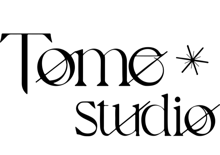
This was the final product. (above)
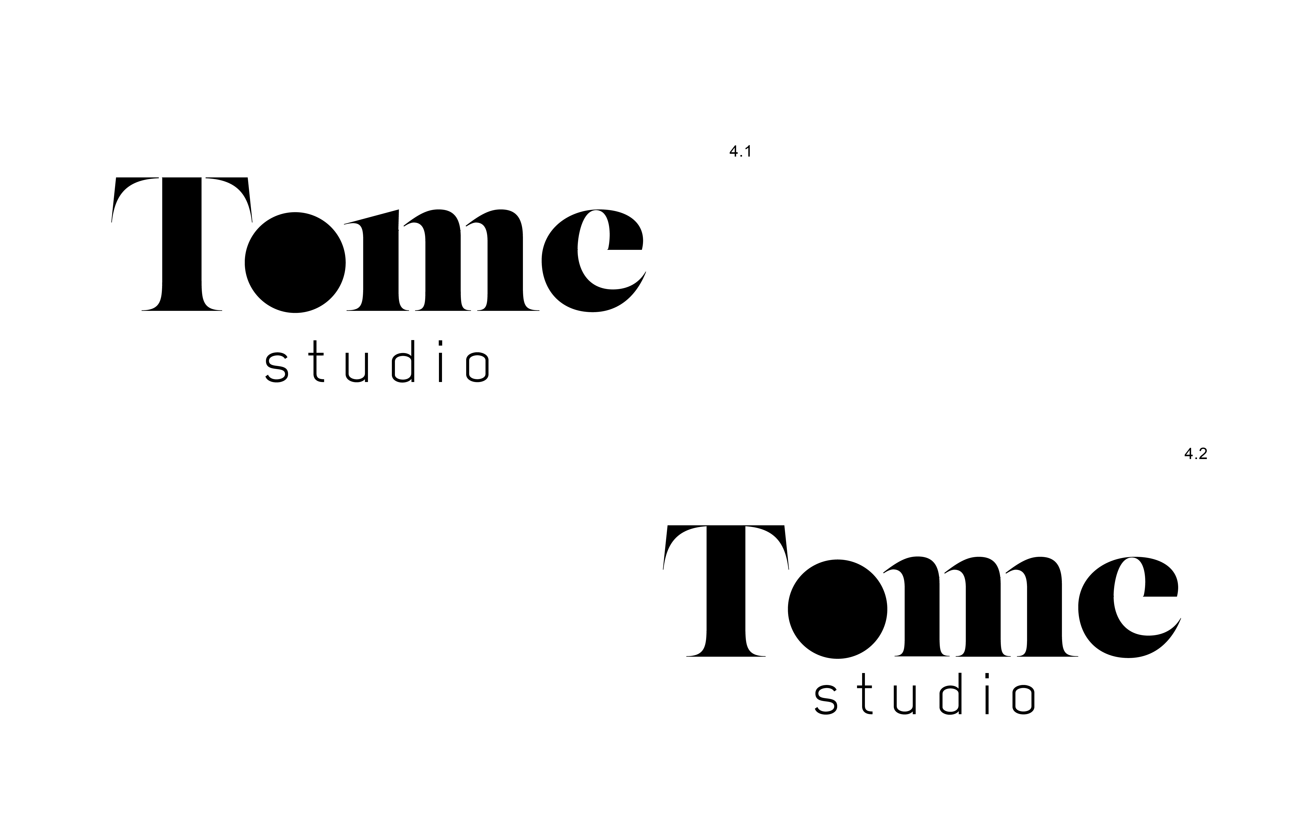
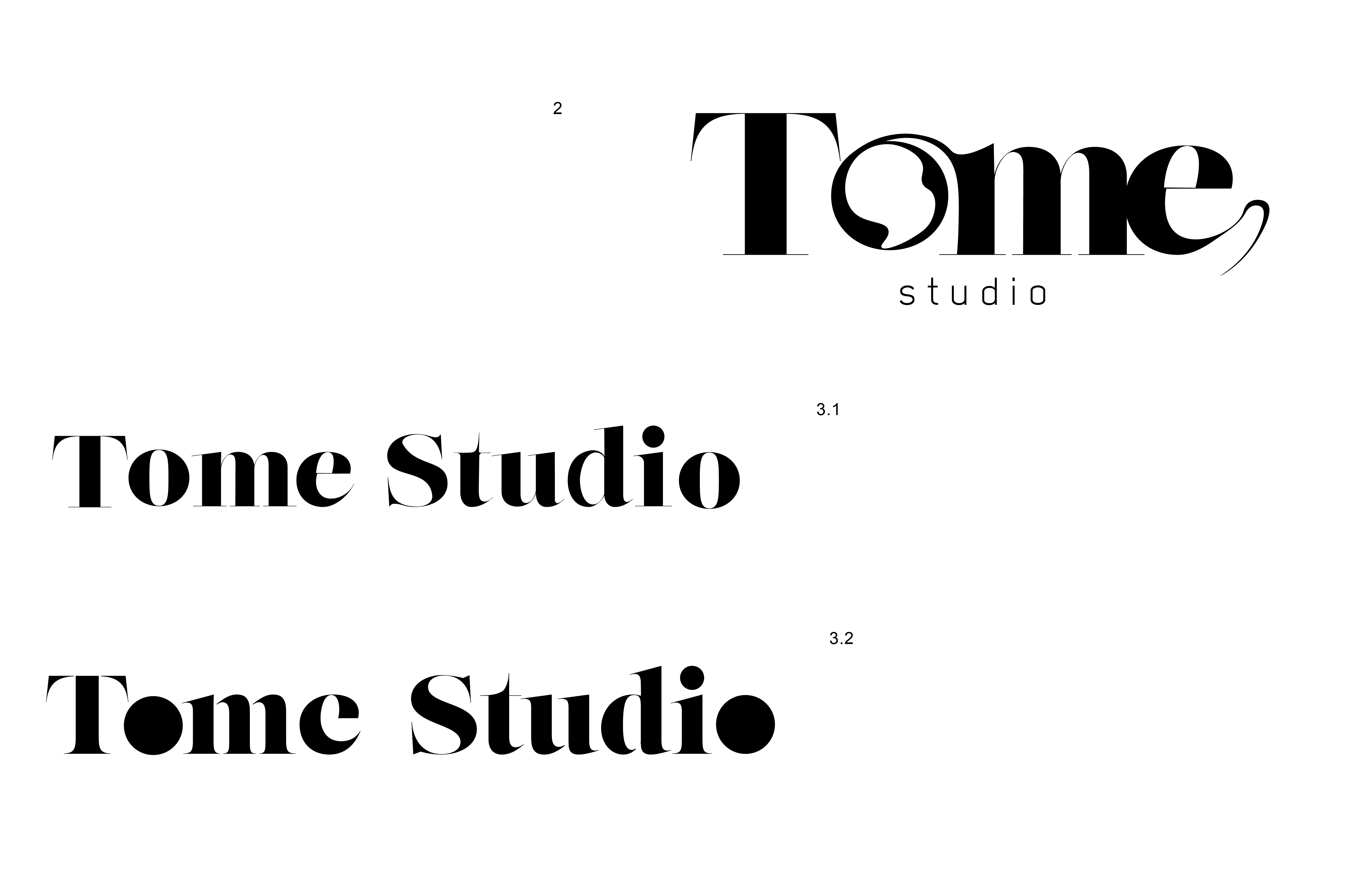
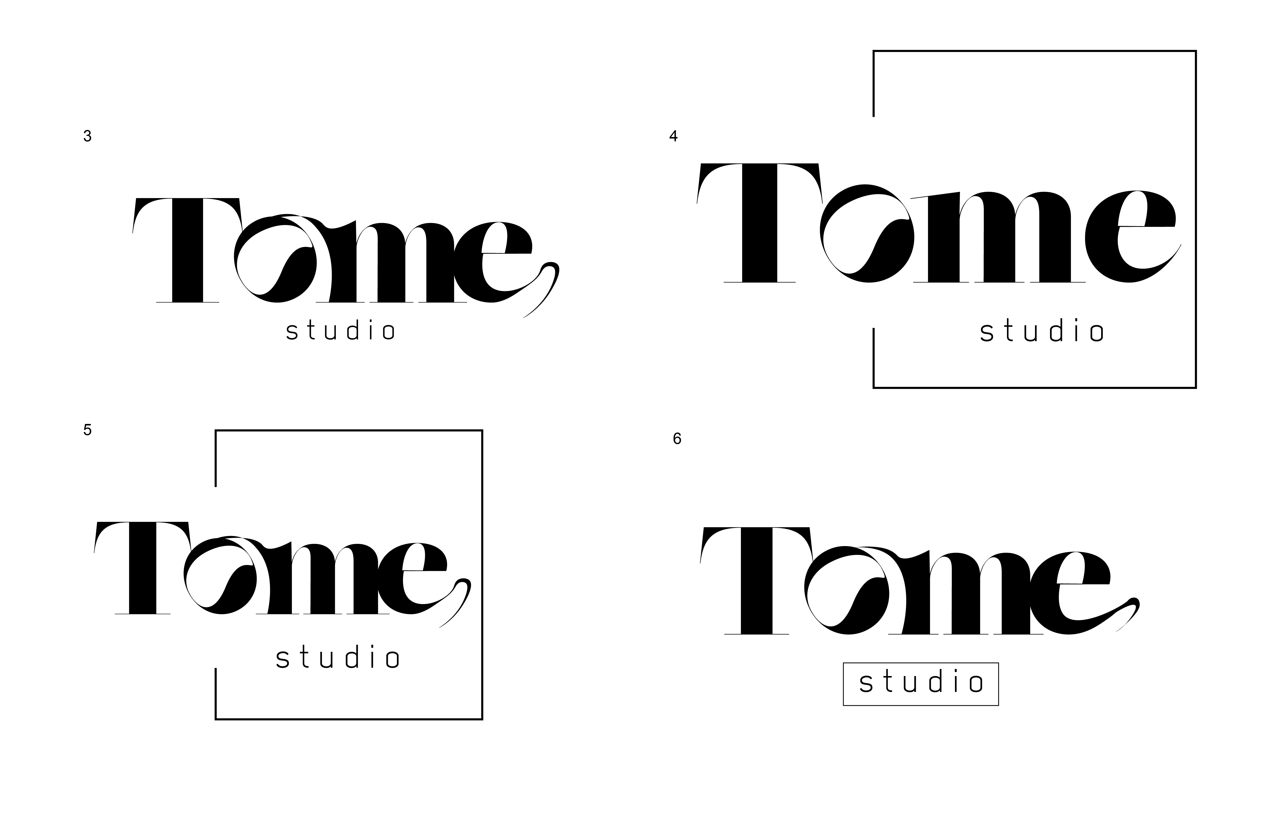
Below is my versions and process to gain a better sense of what Tome is and how we can make that into a logo.


We evolved the final product from this style (above), the client and I wanted to have this movement captive and move away from the following more bold look. We wanted to emphasize that this studio had flow and understanding, we wanted to move to a more finer serif to indicate persona and delicateness. These looks were beginning to feel to bold and abstract (below), rather than decorative and moving.
